Design Challenges
One of the primary UI challenges was establishing a balance between a clean, minimalist design and ensuring that users had all the necessary tools at their fingertips. Achieving an interface that was both visually uncluttered and functionally comprehensive necessitated meticulous layout planning and the integration of intuitive UI patterns.
From a UX perspective, the challenge was to create a coherent experience across different devices. Ensuring that the web and mobile versions provided the same ease of use, despite the variance in screen sizes and interaction models, involved designing responsive and adaptive layouts that maintained feature parity and navigational consistency.
Usability posed its own set of trials, particularly in crafting an email client that catered to both novice and power users. It was critical to simplify the email management process while also providing advanced features that did not overwhelm the casual user. This meant iteratively testing and refining features such as email search, filtering, and sorting to make them as intuitive as possible.
The Design Process
Research
Prior to crafting the high-fidelity designs for the "Email Client" project, I embarked on an investigative journey to deeply understand the landscape and requirements. This groundwork was crucial for creating a product that would not just meet, but exceed, the expectations of both the client and the end-users.
My research began with gathering a comprehensive list of the client's requirements. This step was vital for aligning the project objectives with the user's needs, ensuring that the final design would address real-world use cases and solve actual pain points in email communication.
Next, I carried out an extensive competitor analysis and benchmarking study. By scrutinizing the existing market offerings, I identified common features and innovative functionalities that set industry standards. This process highlighted opportunities for differentiation, allowing me to strategize how to position the "Email Client" with unique features or improved user experiences.Nesting components
Low-Fidelity Wireframes
Back on the main canvas, we’d like to be able to tap 'Clothing' and navigate to an entire new Screen. If you’d connect the component using the Prototyping Connector to a new screen, we could set up an Interaction. However, this would be triggered if we tap anywhere within our component. This isn’t what we want to do, as we want to trigger this transition only from a specific element. This is where Event Variables come in, which are special types of Variables not attached to properties (like opacity or fill) but instead to events.
After shaping the low-fidelity wireframes, I progressed to crafting high-fidelity wireframes for the "Email Client" project. This phase involved adding detailed design elements, including color, typography, and UI components, to create a polished and realistic representation of the final product, ready for stakeholder review and approval.
Exploring the Key Features
Inbox
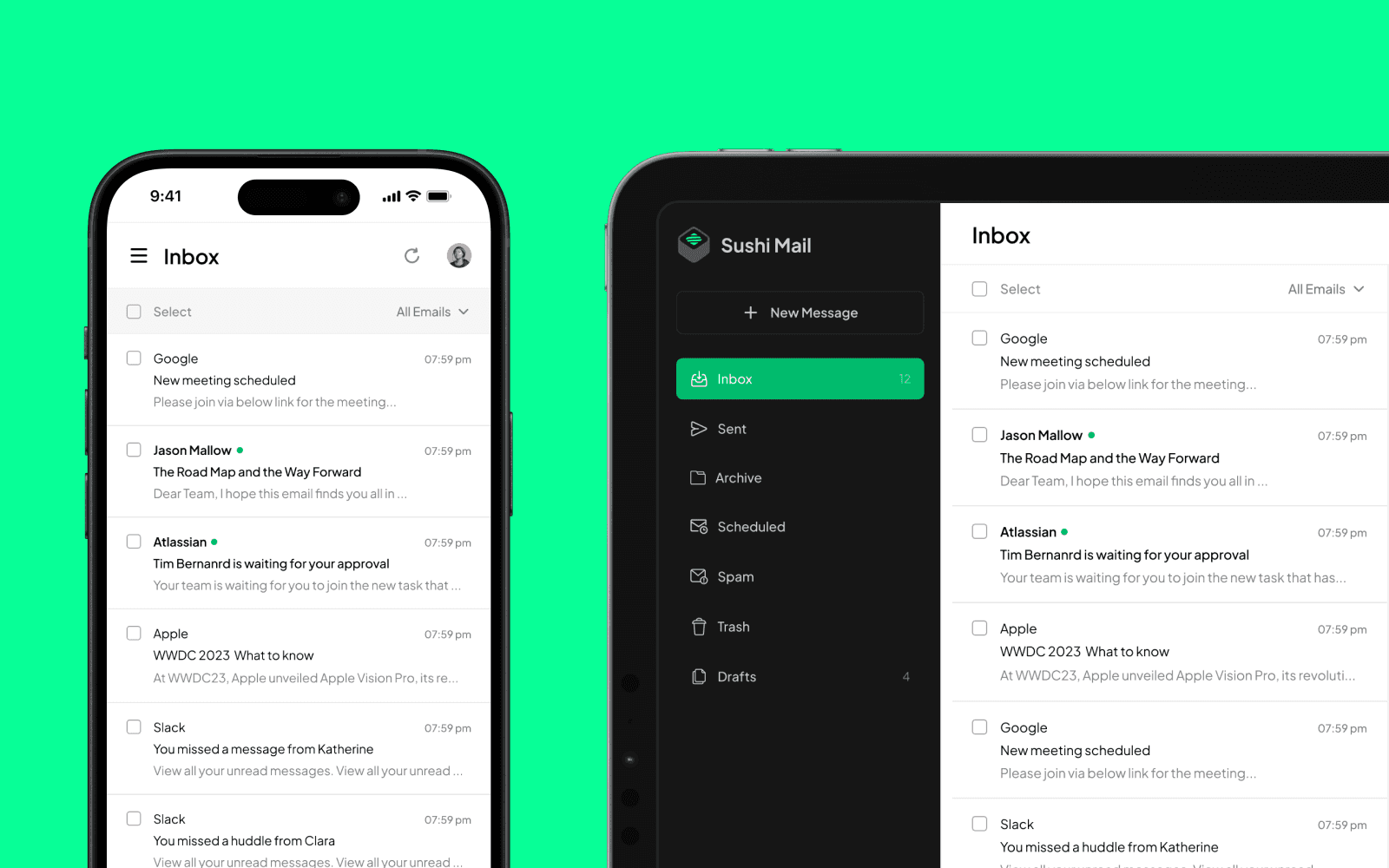
In designing the home page for the "Email Client" on both mobile and web platforms, I focused on delivering a user experience (UX) that prioritized usability and accessibility. The layouts for both versions are clean and intuitive, with a clear hierarchy that guides the user naturally through the functions of the email client.
For the web version, the sidebar is neatly organized, offering easy access to different folders like Inbox, Sent, and Trash. The main content area is spacious, displaying emails with ample white space to prevent visual clutter, which enhances readability and focus.
Transitioning to the mobile version, I maintained the same usability principles. The layout adapts gracefully to a vertical orientation, with a simplified menu that ensures all functionalities remain accessible even on smaller screens. The mobile interface includes touch-friendly elements like a prominent floating action button for composing new emails, ensuring ease of use on the go.
Read Email
For the "Read Email" page of the "Email Client," I designed a user flow that emphasizes clarity and ease of reading, ensuring that the experience of engaging with email content is focused and distraction-free.
Upon clicking an email from the inbox list, the user is taken to this full-view page, where the email content takes center stage. I chose a clean and spacious layout to prevent cognitive overload, allowing users to concentrate on the message. The UI provides ample white space around the text, with a clear demarcation between the email body and the surrounding UI elements, enhancing readability.
The Outcome
The "Email Client" project culminated in a versatile and user-friendly platform that successfully met the challenges of modern email communication. The UI is marked by its minimalist design that does not compromise on functionality, ensuring that users have immediate access to a full suite of features without feeling overwhelmed. The UX considerations resulted in a cohesive and consistent experience across both web and mobile platforms, emphasizing a responsive layout that adapts to various devices and screen sizes.
Usability testing proved critical in fine-tuning the client, particularly in refining the process of email management, crafting a reliable attachments system, and ensuring that accessibility standards were met. Through iterative design and continuous user feedback, the project delivered an email client that caters to a diverse user base, balancing simplicity with the complexity of advanced features.
The final product stands as a testament to the power of user-centered design and strategic problem-solving, showcasing an email application that's not only easy and pleasant to use but also secure and efficient. It represents a significant step forward in digital communication tools, tailored to the needs of contemporary users.